SheDot Festival
Branding for a women’s comedy festival in Toronto
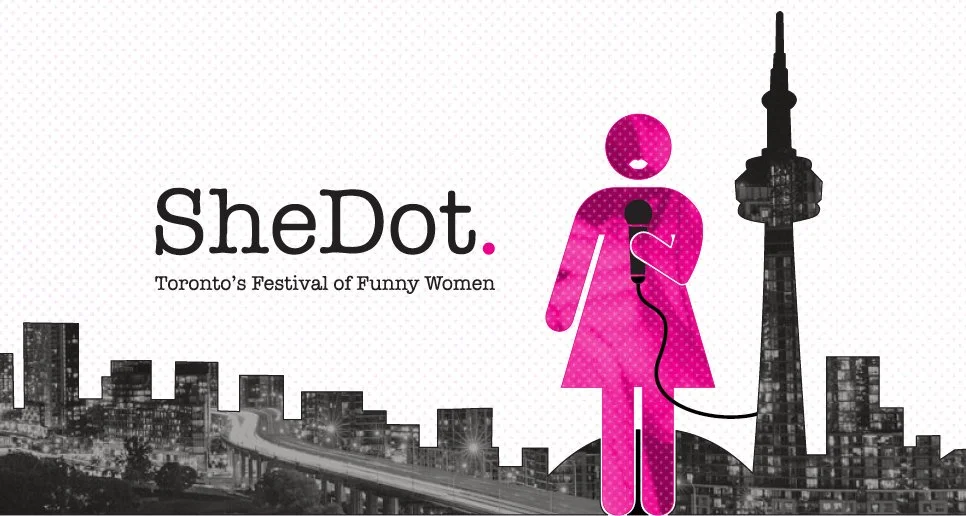
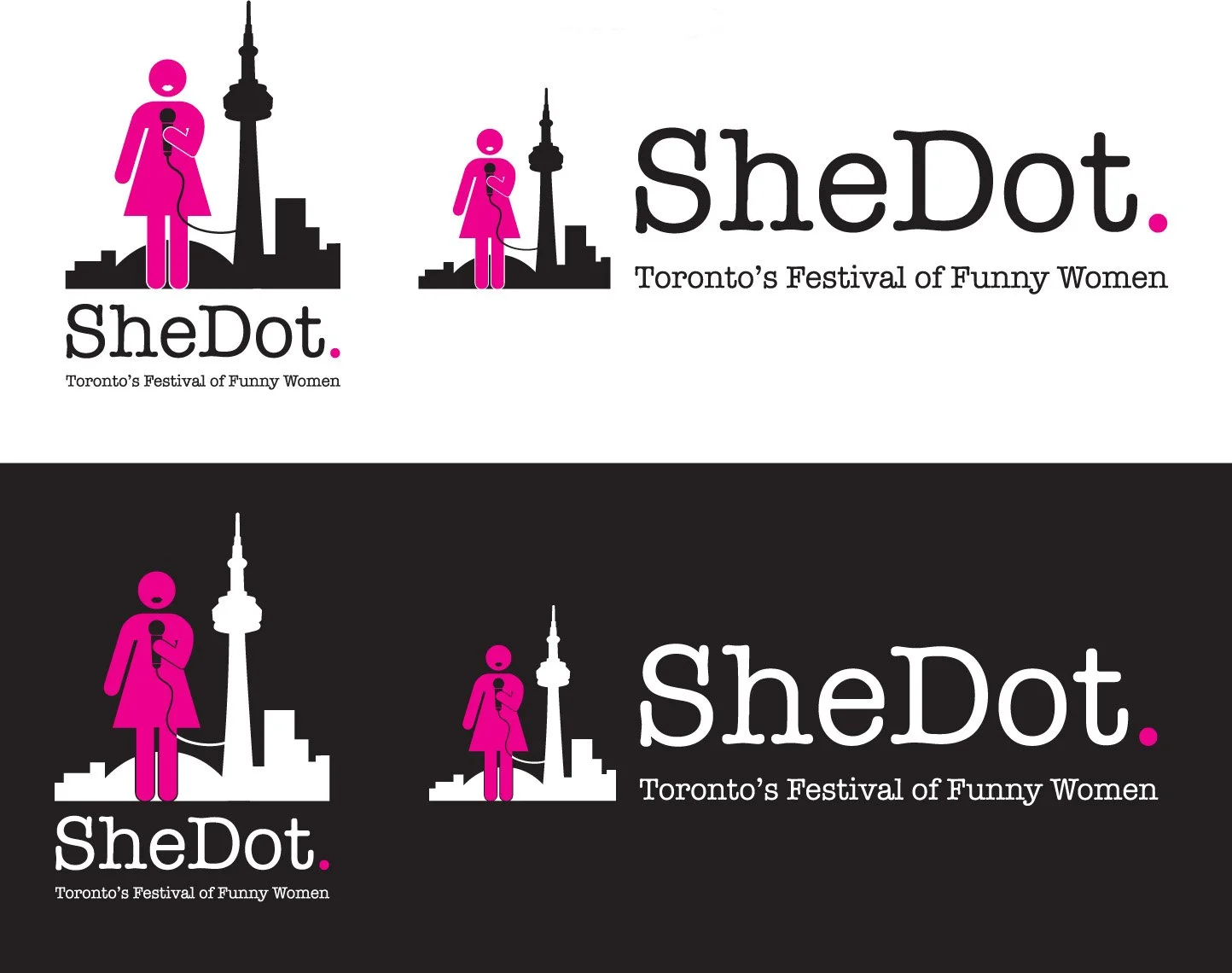
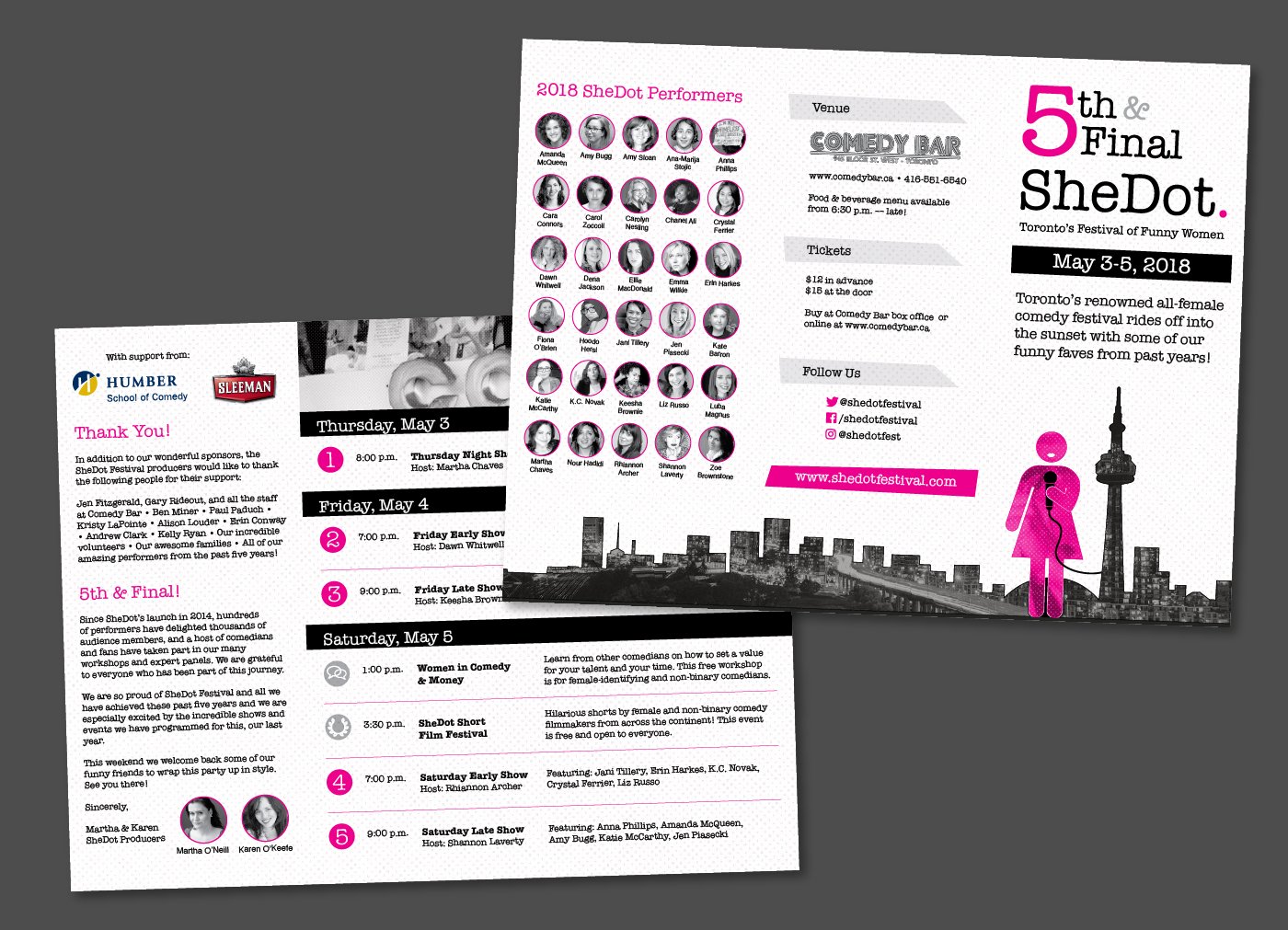
Logo and visual system for SheDot, Toronto's festival of funny women. The name plays on the city's "T-Dot" nickname while centering female-identifying performers. I developed a bold, geometric identity built around the festival's dual concept. Very “she". Fairly “dot.”
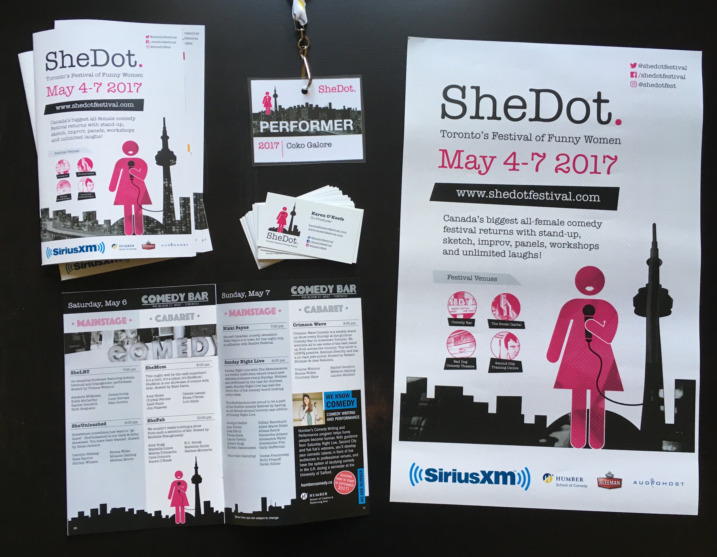
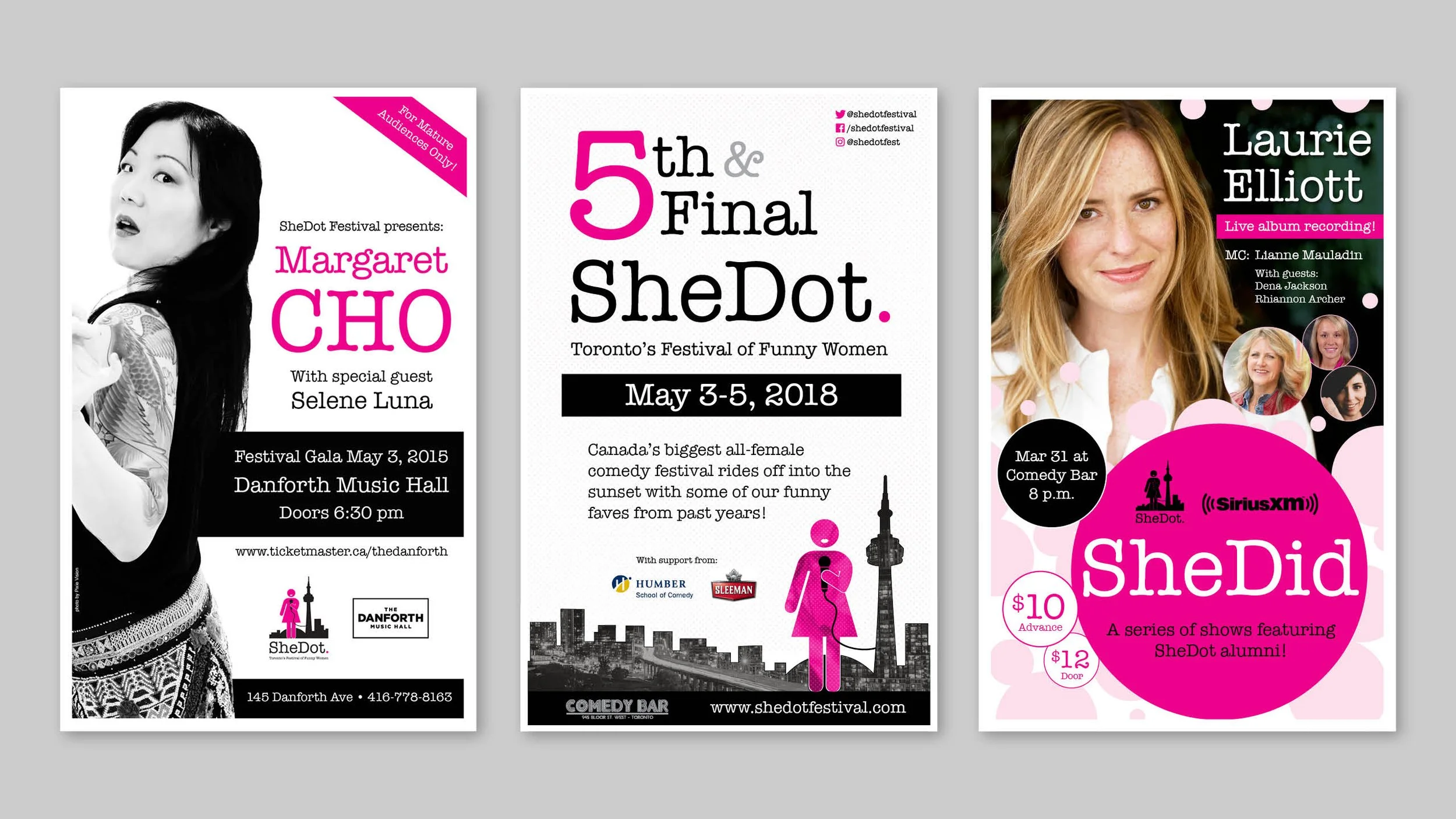
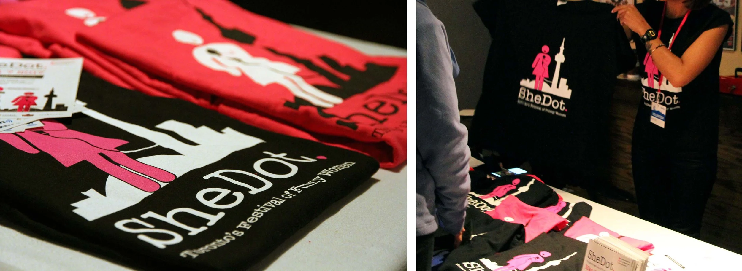
The system scaled across print materials, social media graphics, and all festival touchpoints, creating cohesive brand recognition throughout Toronto's comedy scene.

Social media reels
Meet Daisy
SheDot brand character
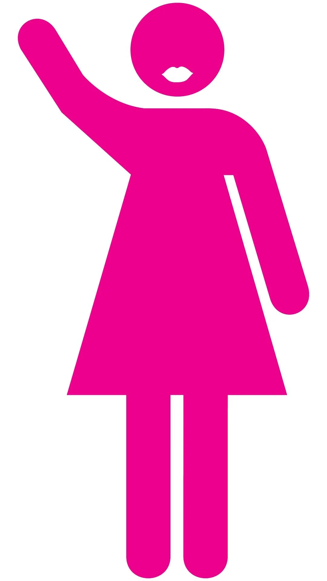
The logo’s pink figure (affectionately called "Daisy") is based on the universal female pictogram found in wayfinding signage. She appears throughout the festival materials performing various actions, serving as both a visual anchor and an invitation: a friendly beacon signaling to women that this festival is for them.